Mobile app · 2026
Sosta
A breath before you open. A 6-second pause that interrupts automatic phone use, with no guilt and no streaks.
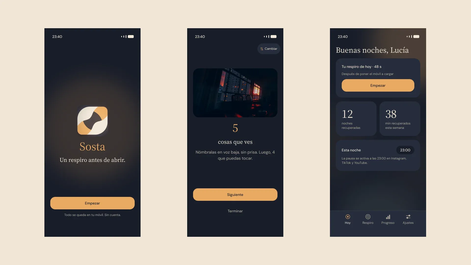
Team + individual
Summary
- Problem
- Planning a digital detox doesn't work: people open their phones on autopilot.
- What I did
- Team research, then the product on my own: flows, design system, prototype and testing.
- Outcome
- 90 to 100% task success across the three flows in Maze, with 11 people.
Team Observe
Context
CEI gave us a broad theme: digital detox and mindfulness. The obvious answer was a challenge app for spending hours without your phone, and the research made us distrust it from the start.
0
−57%
That became the project’s thesis: interrupting the automatic gesture works better than banning it.
Team Observe · Synthesize
Research
As a team we did desk research, netnography, benchmarking, a SWOT, a 33-person survey and two interviews. From all of that we built Lucía, our main persona, and a guiding question: how might we help someone who already tried to disconnect and failed let go of their phone in their free time, without feeling they are missing out or failing a challenge?
28/33
16 + 12
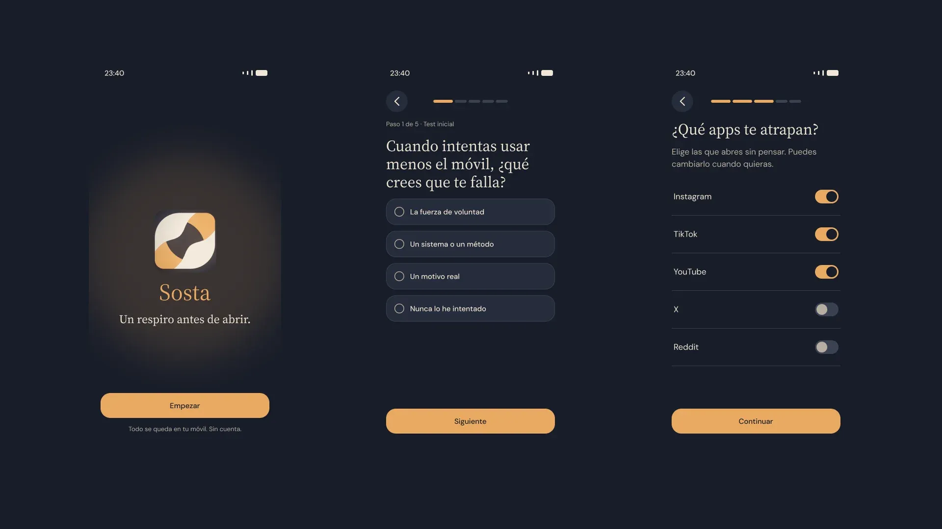
It's not a lack of willpower, it's autopilot
The survey answers and the two interviews (Marta and José) point to the gesture, not the desire. Most people don’t decide to open the app: they just open it.
Guilt drives people away
Apps that greet you with alarming reports, like Opal’s onboarding test and its “years lost”, push people away. In this category the real risk isn’t persuading people, it’s keeping them using it.
Individual Deliver
Key decisions
Discarded
Blocking the app with timers and streaks
Chosen
A 6-second pause before opening, breathing with you
Micro-friction cuts use by 57% (one sec, PNAS 2023), and skipping a day doesn’t break a habit (Lally, 2010). That’s why Sosta has no streaks to lose.
Discarded
Just interrupting, like other apps do
Chosen
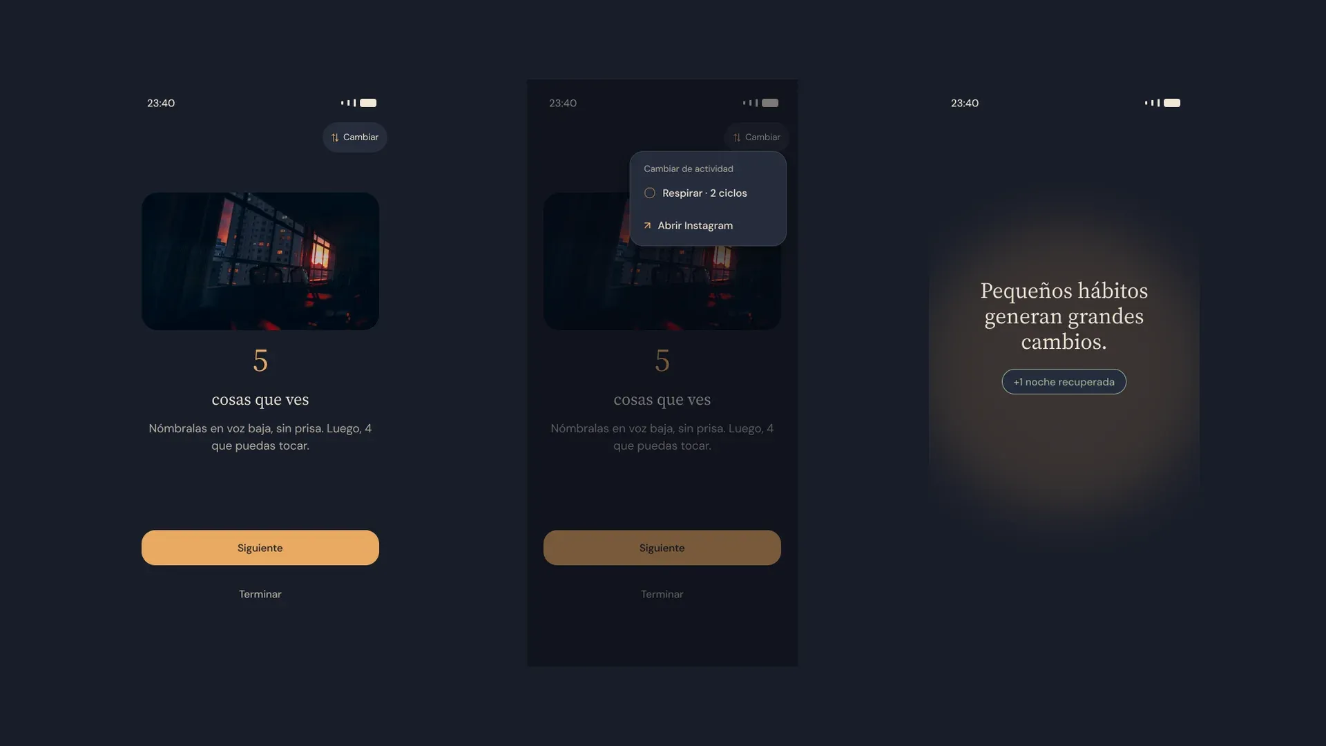
Interrupt and replace: a 1-2 min breath or “Look around” 5-4-3-2-1
one sec already asks you to “Take a deep breath”. Sosta’s difference is offering something better to do in that moment, without guilt. “Look around” is my contribution, taken from Atomic Habits.
Discarded
Monthly subscription
Chosen
Free core and a one-time payment
In the survey, 4 of 33 would pay once and only 1 would subscribe. Forest already works with a one-time payment.
Discarded
An alarm tone, with reports of lost time
Chosen
A bedside lamp: warm night, amber and sage
The brand had to keep you company, not watch you. The “La Pausa” logo is an hourglass that breathes. The palette has two modes, Night and Paper, every color pair passes AA, and the type pairs Source Serif 4 with DM Sans.
Individual Deliver
Solution
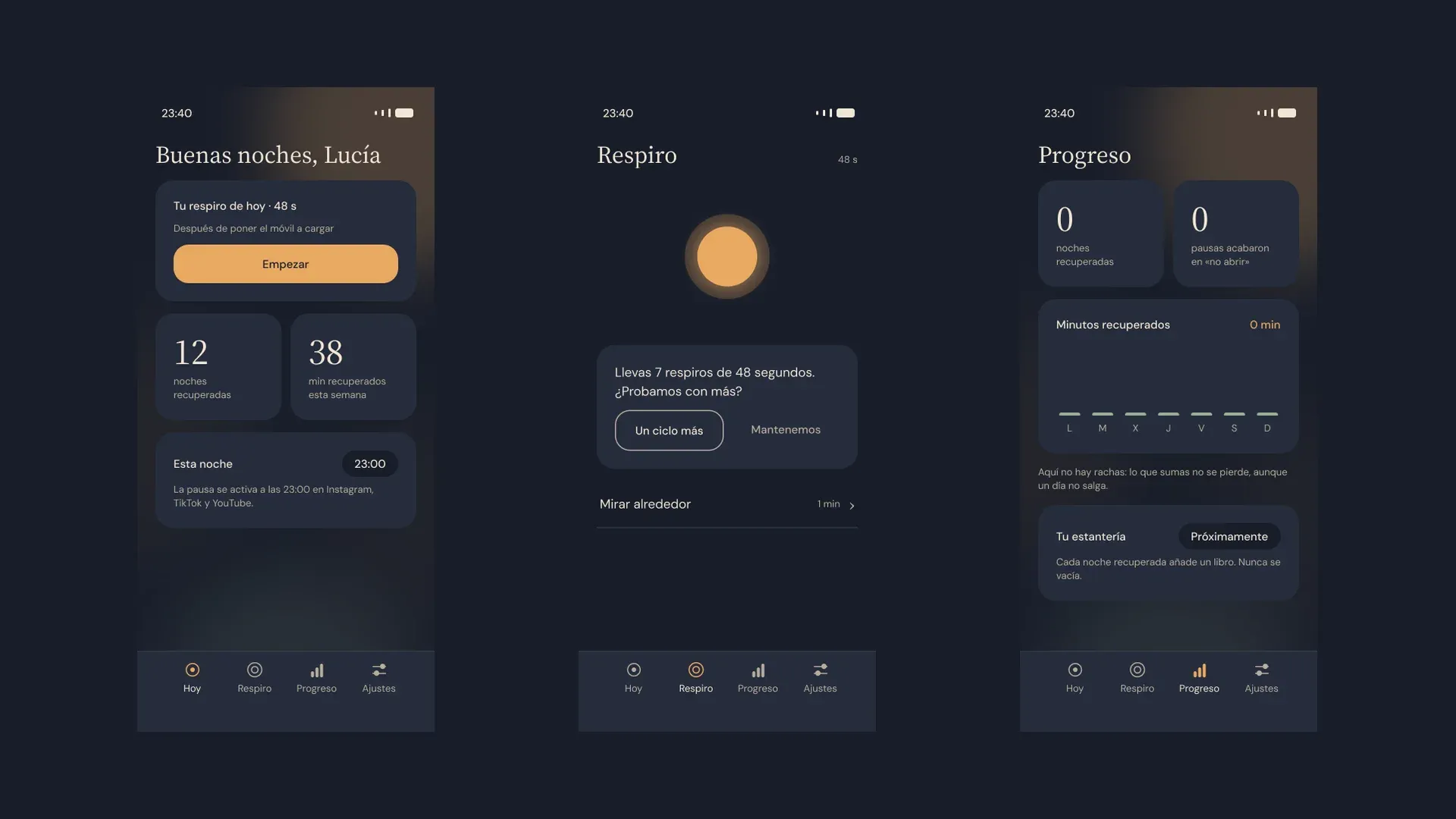
The product lives in three moments: a short onboarding that learns your triggers, the pause that appears before you open an app, and a calm app for the daily breath.
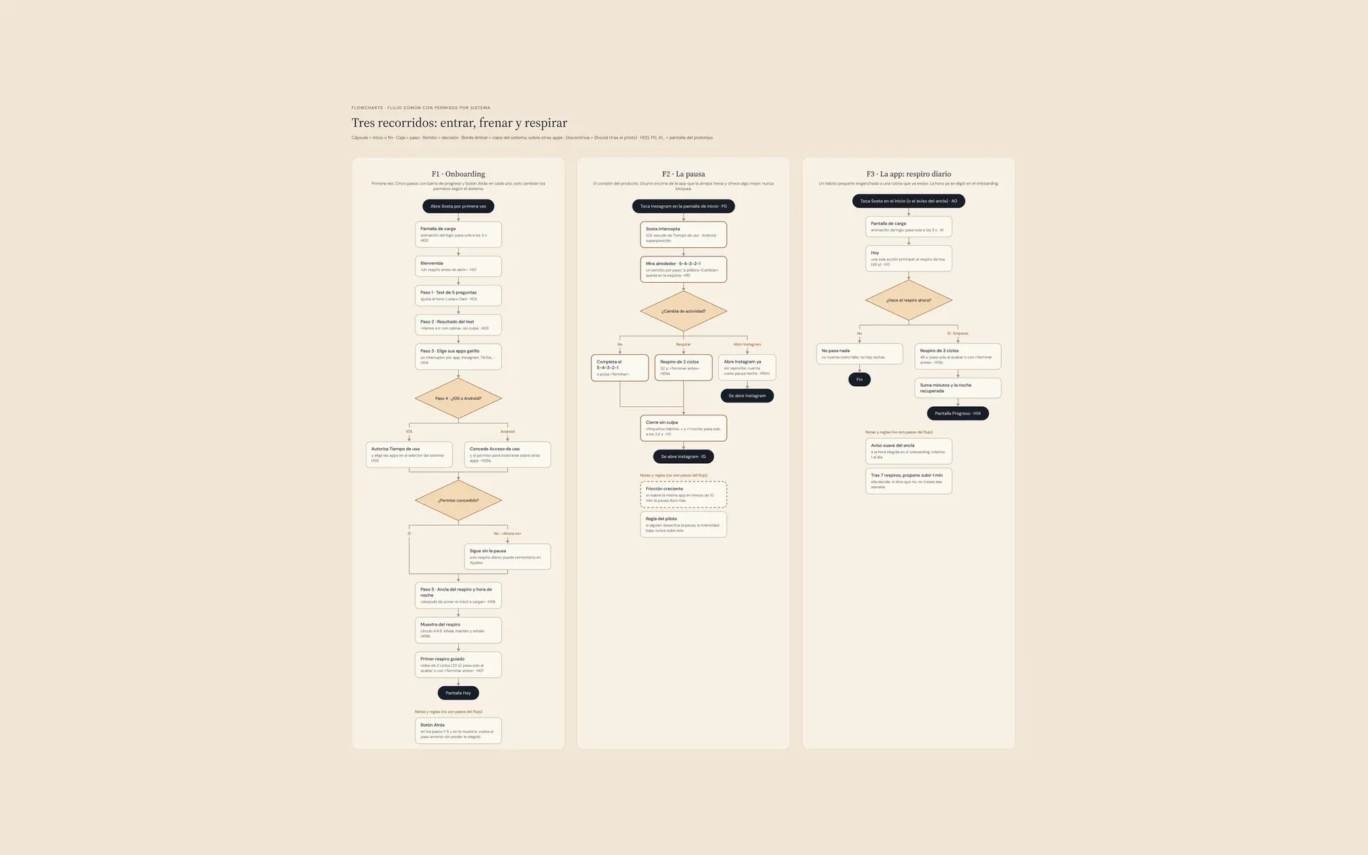
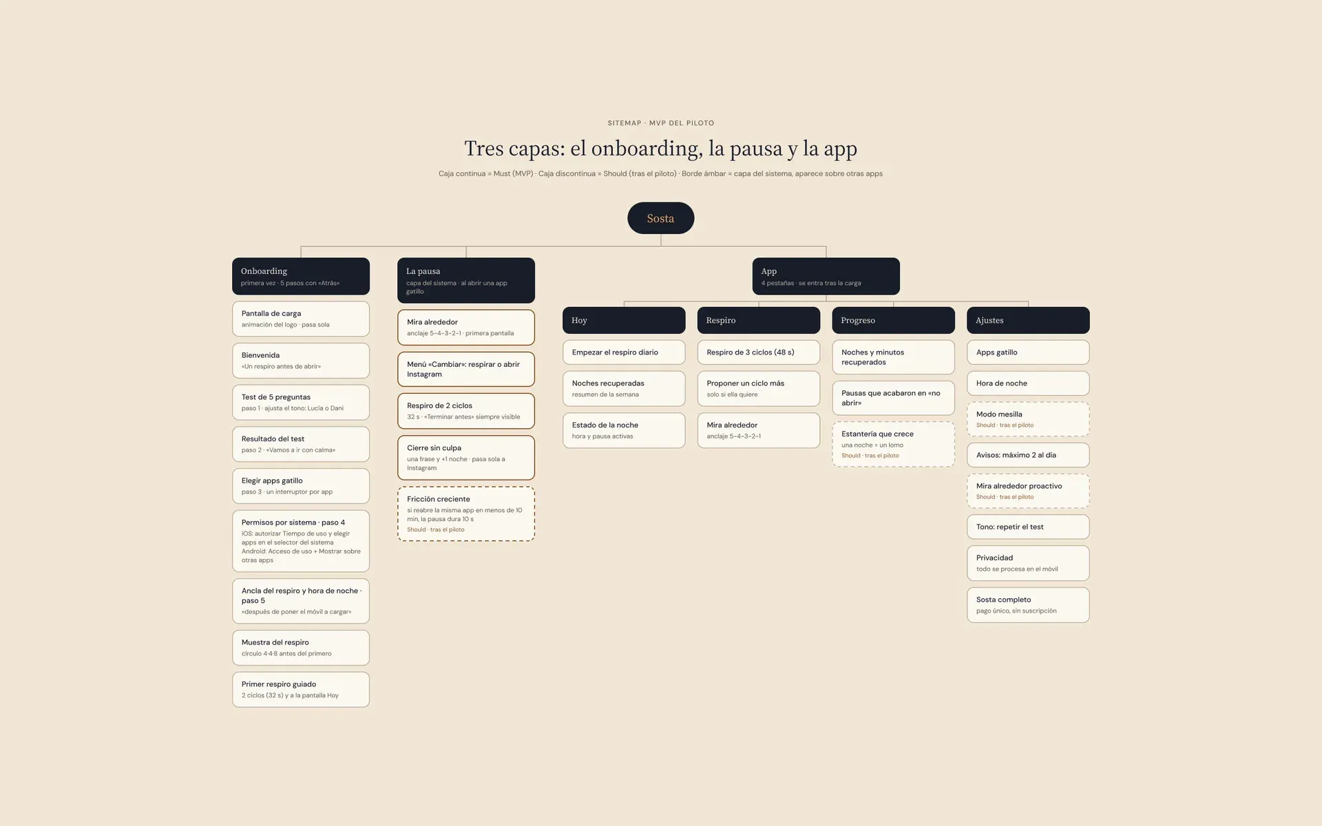
Individual Testing
Validation
I tested the prototype with an unmoderated Maze study from October 5 to 7, with 11 people recruited over WhatsApp. It’s a convenience sample: good for finding problems, not for drawing general conclusions.
90.9%
100%
70/100
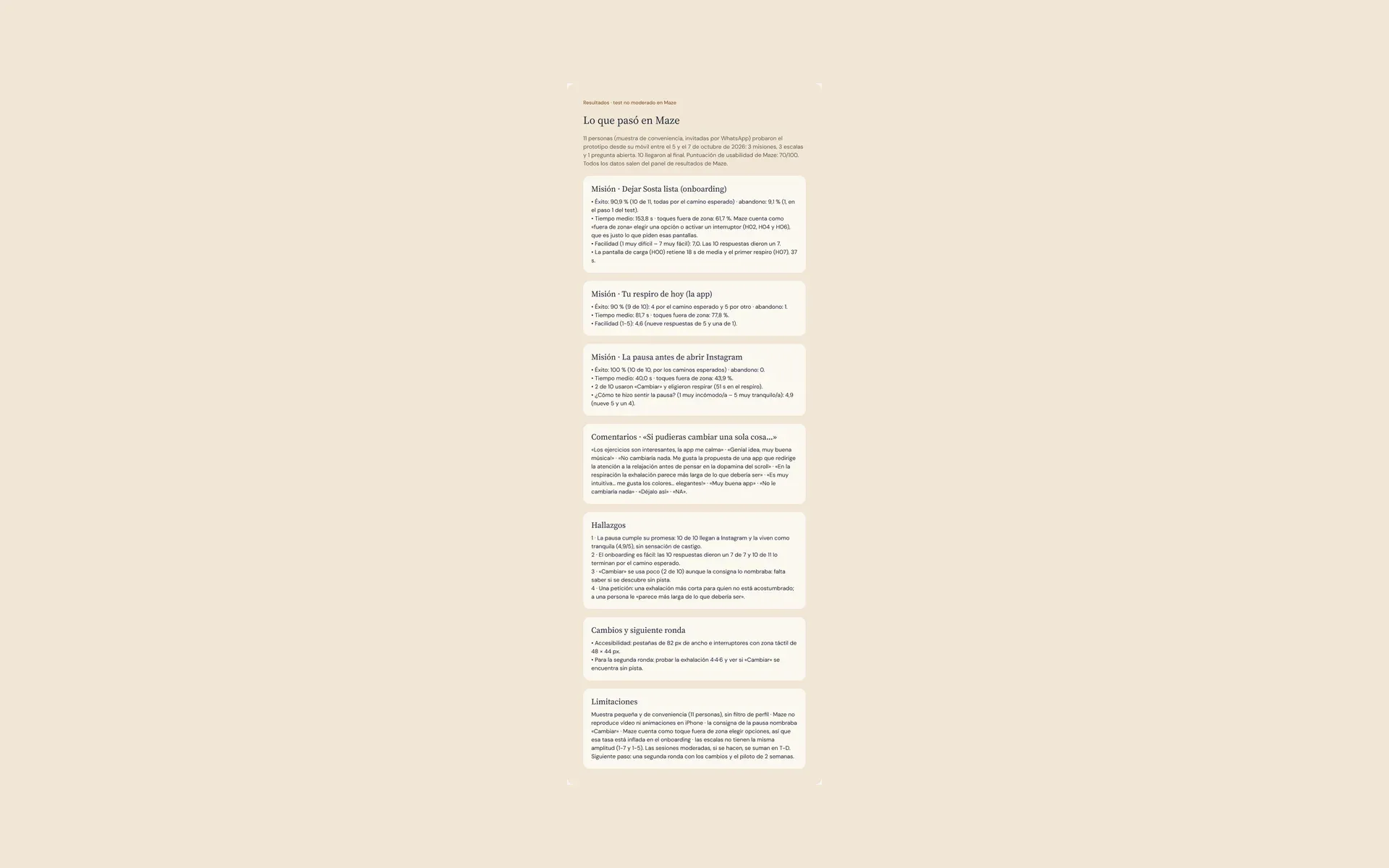
The findings clustered around two points, the “Switch” pill and the exhale in the breathing, and both have their iteration in the Figma file. One honest note: all 11 responses tested the version before the iteration, because Maze didn’t resync.
Individual
Learnings
- A closed survey doesn’t replace interviews: we did 2 of the 3 we planned, and it shows in how deep the findings go.
- Success per flow told me more than the overall score: the 70/100 hid that the problem was on the Today screen.
- A Maze prototype is designed for the tool: no video and no timers, so I had to add taps where the real app would move on by itself.