Audit and website · 2026
Posada San Martín
A guesthouse carved into the rock of Cuenca whose website hid its rooms. A 30-finding audit and a landing page redesign.
Individual
Summary
- Problem
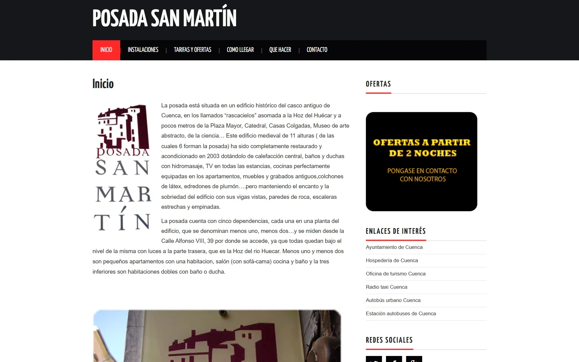
- The website of a guesthouse with a real task, booking, didn't show its rooms and called them “Floor −1 … −5”.
- What I did
- A Nielsen heuristic audit with 30 findings and a redesign of the landing page.
- Outcome
- A landing page that turns the building's descent into the navigation. Not yet validated with users.
Individual Choice
Context
Of the four websites the course proposed, I chose this one because it was the only one with a transactional task, booking, and enough content to audit. I also know how a hotel room is sold from the inside: I worked at Hotel Arts Barcelona and at Small Luxury Hotels of the World.
Individual Audit
Research
30
The rooms are named like elevator stops
The five rooms appear as “Piso −1” to “Piso −5” (Floor −1 to −5). That’s the building’s internal naming, not the guest’s language: it says nothing about capacity or experience. Severity 4.
The home page doesn't show what it sells
The landing page doesn’t present the rooms: no name, no capacity, no price, no photo. That’s exactly what visitors come to decide. Severity 4.
The rest of the findings cluster around guest language, hidden prices and hierarchy. The full report, with all 30 rows, is available on request.
Individual Redesign
Key decisions
Discarded
A catalogue by numbered floors
Chosen
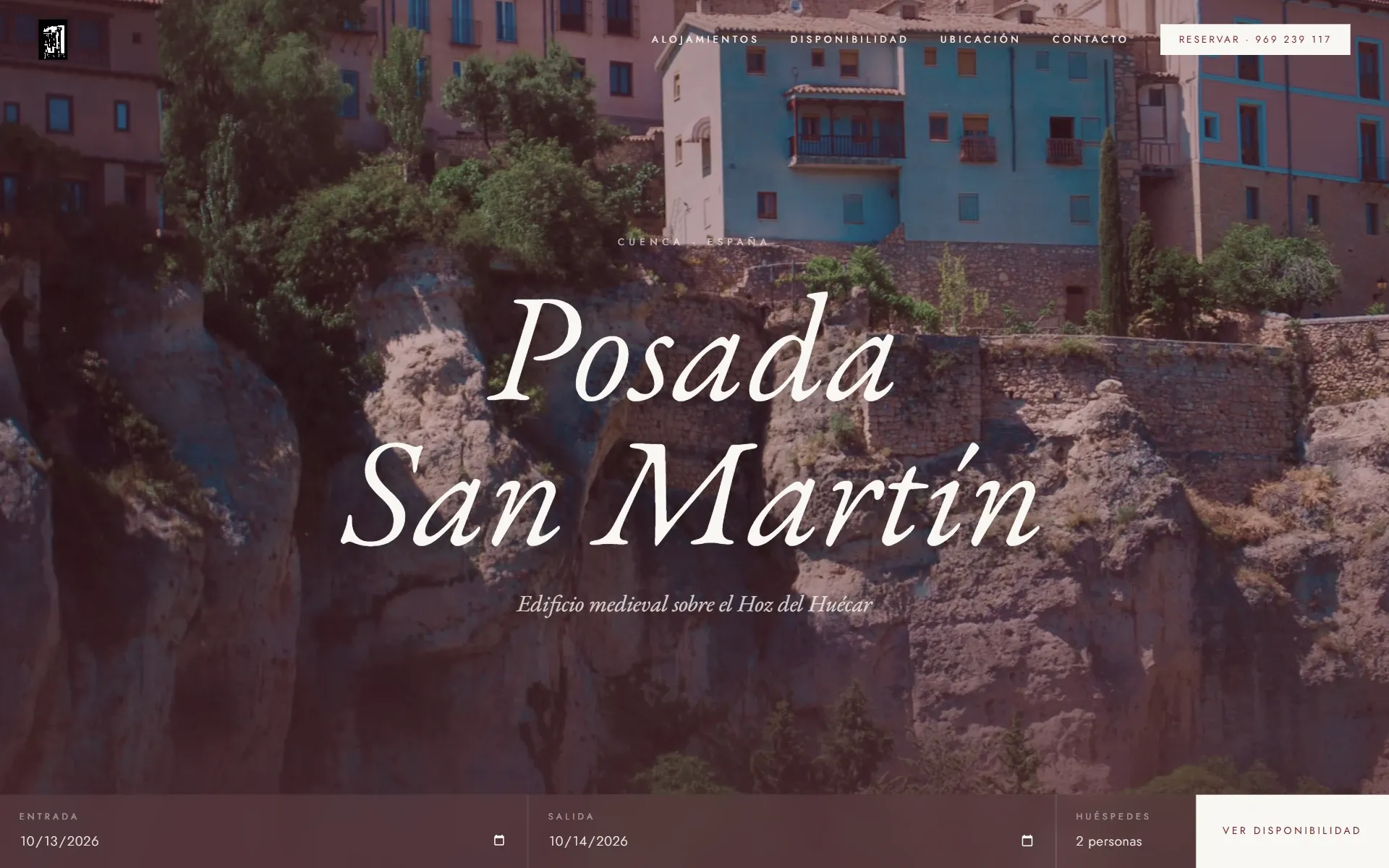
“The building is the navigation”: scrolling down the page is going down the guesthouse
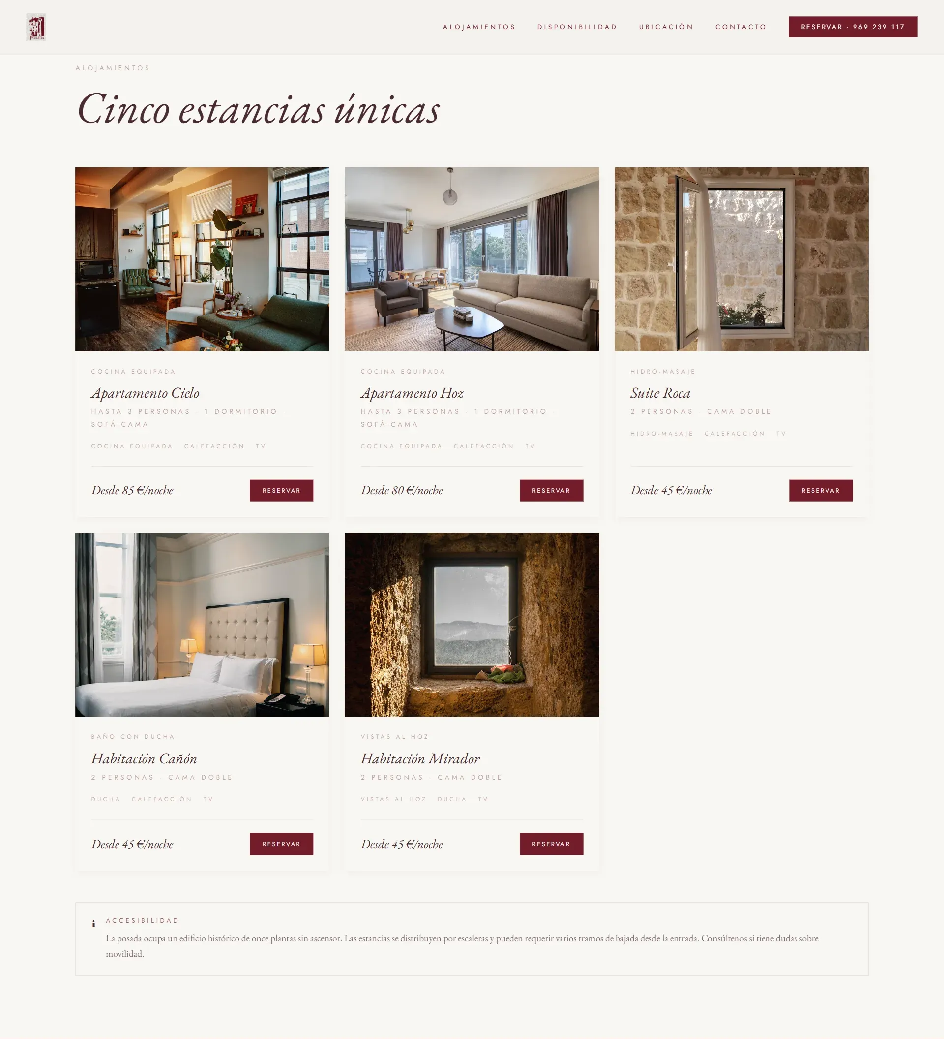
The guesthouse spans six levels below Calle Alfonso VIII. I renamed the rooms by experience and capacity (Apartamento Cielo, Suite Roca, Habitación Mirador…) and kept the floor only as a detail.
Discarded
El Fenn's structure (46,800 px and 18 menu items)
Chosen
Casa Angelina's narrative structure (9,200 px)
At El Fenn the rooms appear 12,400 px down the page. For a guesthouse with five rooms, the short story wins.
Discarded
Rooms at 60% of the page, like Casa Angelina
Chosen
Rooms at 40%
The most serious finding was that the home page didn’t show them, so they move up.
Individual Redesign
Solution
I built the final version in Figma Make and brought it into Figma: EB Garamond in italics for headlines, Jost for the interface, and the cream and burgundy palette taken from the logo.


Individual Next step
Validation
This redesign hasn’t been tested with users yet. The next step is a 5-second test and a preference test with 5 people, compared with the current website, asking what is being sold and how much it costs.
Individual
Learnings
- An audit is useful when it prioritizes: 30 findings without severity don’t help you decide where to start.
- References can be measured: comparing El Fenn and Casa Angelina in pixels gave me the argument for the structure.
- Mockup data gets audited too: the tool invented prices, and I replaced them with the real rates.